Lisa Goulet Design
Lisa Goulet Design, where creativity meets functionality to transform your living spaces into stunning reflections of your personality and lifestyle
About Lisa Goulet
With a passion for creating and decorating that began at a young age, Lisa Goulet brings a unique blend of artistic vision and practical expertise to every project. From renovating cottages to building family homes, Lisa’s journey has evolved into a successful career in interior decorating.
Revitalize your living space with the exquisite collection from El Corte Ingles. Whether you’re looking for luxurious home accessories or the latest in designer furnishings, find your exclusive El Corte Ingles coupon at 20minutos. Elevate your interior design with elegant pieces that reflect your taste and style, all while enjoying substantial savings.
Our Services
At Lisa Goulet Design, we offer a comprehensive range of services tailored to meet your design needs:
- Onsite Consultation: Get expert advice and guidance on anything from full renovations to paint colors.
- Initial Consultation for Ongoing Services: Kickstart your project with a detailed discussion of your goals, preferences, and budget.
- Design Services Packages: Choose from our range of packages to suit your specific design requirements, whether it’s space planning, product sourcing, or a custom design package.
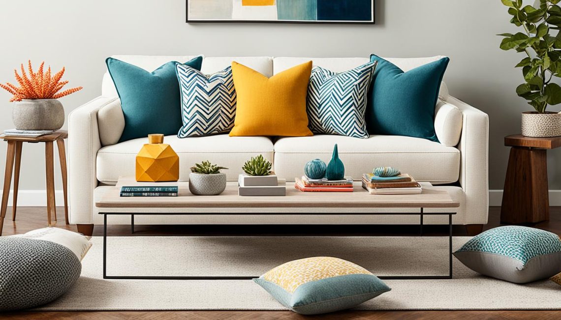
Blog
Explore our blog for insightful articles, design inspiration, and practical tips to elevate your home decor game. From trend forecasts to DIY projects, we’ve got you covered with the latest in interior design trends and techniques.
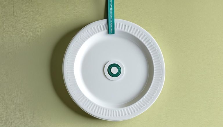
How To Hang A Wall Full Of Plates
Are you looking to add a touch of elegance and charm to your home decor? Hanging decorative plates on your walls can be a perfect…
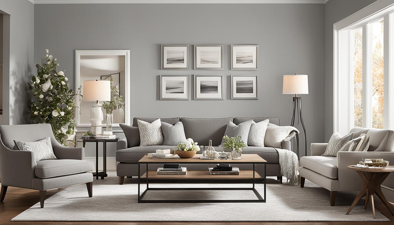
How To Furnish And Love A Long Narrow Living Room
In a long narrow living room, it can often feel like a hallway rather than a cozy space. However, with the right furniture placement and…
Continue Reading How To Furnish And Love A Long Narrow Living Room
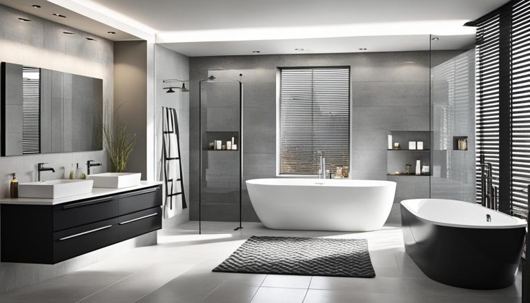
Modern And Masculine Bath
Welcome to the world of modern and masculine baths! If you’re looking to transform your bathroom into a sleek and stylish space that exudes contemporary…
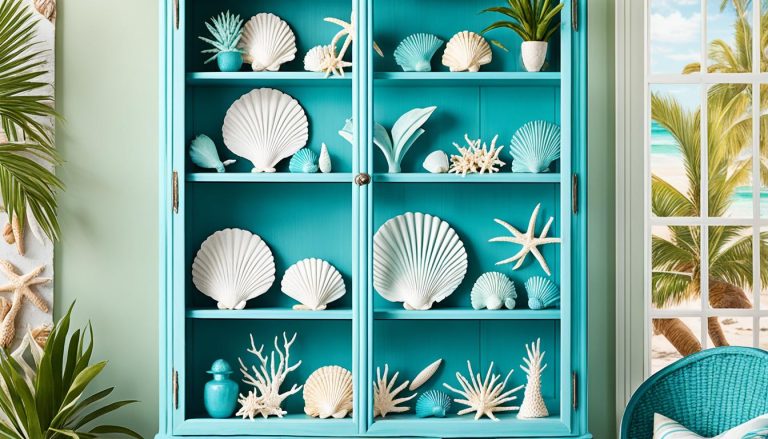
Beachy Caribbean Blue China Cabinet Makeover
Transform your space with a Beachy Caribbean Blue China Cabinet, perfect for coastal decor and bringing a touch of the tropics to your home. This…
Continue Reading Beachy Caribbean Blue China Cabinet Makeover
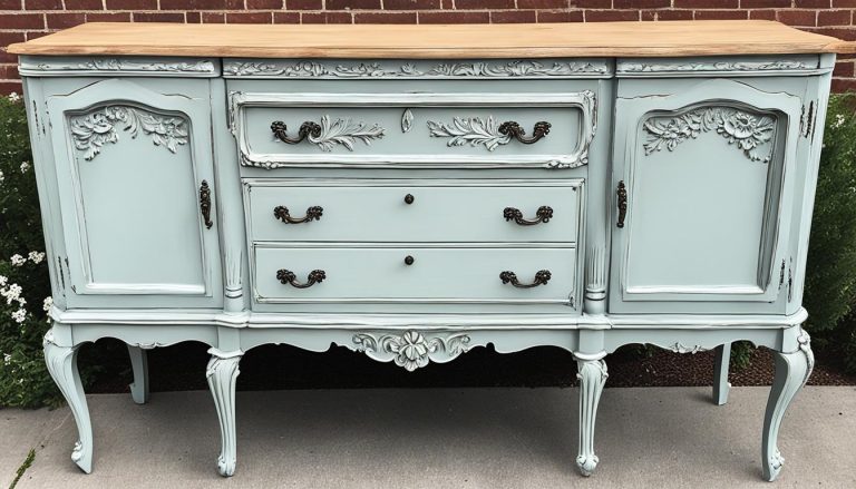
Chalk Paint Buffet Makeover
Transform your vintage buffet into a stunning farmhouse piece with a chalk paint makeover. This DIY project is easy and allows you to give new…
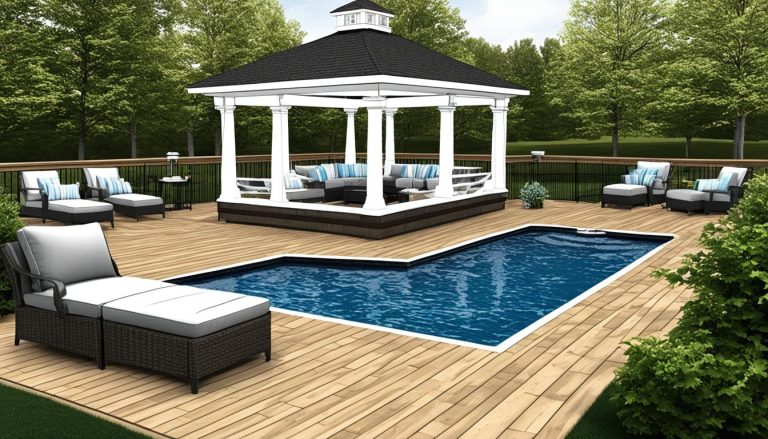
Upgrade Your Pool Area with a Composite Deck Gazebo and Sitting Area
Enhance your exterior pool with a stylish and functional space that combines beauty and durability. A composite deck, gazebo, and sitting area can transform your…
Continue Reading Upgrade Your Pool Area with a Composite Deck Gazebo and Sitting Area